
VC.
ProjectsAboutContact

Varun Cumbamangalam.

Senior IoT and Edge AI Engineer, AI Product Manager at OraLens Healthcare

ProjectsAboutContactPrivacy

© 2026 Varun Cumbamangalam. Built with Next.js and Tailwind CSS.

# Battery drain analysis - extract mV readings per device per session # E:/Watcherr/07-testing/battery-testing/WatcherrPro Battery life.xlsx import openpyxl, pandas as pd wb = openpyxl.load_workbook("WatcherrPro Battery life.xlsx", data_only=True) ws = wb["Battery Test"] # Collect (date, time, device_mac, battery_pct) rows records = [] for row in ws.iter_rows(min_row=4, values_only=True): date, time, batt_pct, notes = row[1], row[2], row[3], row[4] if batt_pct is not None: records.append({"date": date, "time": time, "battery": batt_pct}) df = pd.DataFrame(records) df["datetime"] = pd.to_datetime(df["date"].astype(str) + " " + df["time"].astype(str)) drain_per_day = df.groupby(df["datetime"].dt.date)["battery"].agg(["first","last"]) drain_per_day["drain"] = drain_per_day["first"] - drain_per_day["last"] print(drain_per_day)
All Projects
Hardware & Firmware QA - IoT Wearable Platform logo
HardwareMobile

Hardware & Firmware QA - IoT Wearable Platform

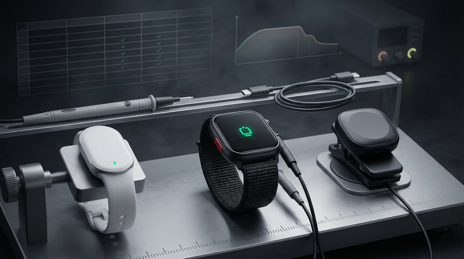
QA gating across 23 test cycles, from bring-up to production release.
0

Test Reports Filed

0%

Pass Rate

0 Devices

Watcherr Lite · Pro · Gateway

Tech Stack

Test PlanningExcelPythonAndroid E2EBattery AnalysisRisk Assessment

The problem

If an elderly resident presses their distress button and the wristband fails to send the alarm, that's a patient safety incident - not just a bug. The firmware had to be rigorously tested before every release across three different device versions, and battery life had to be tracked separately because each firmware update could silently drain the battery faster.

The challenge

IoT wearable firmware for a care-home safety device has zero tolerance for missed alarms or false negatives - a failure to transmit a distress signal in a real emergency is a patient safety incident. At the same time, the device ships to non-technical care staff who cannot diagnose or work around bugs in the field. QA had to catch defects before every release, validate that behaviour matched the firmware spec across three distinct hardware variants (B7, B8, W7), and maintain a structured test record trail for regulatory purposes. Battery life also had to be validated continuously as firmware changes to the BLE stack, sleep modes, and alarm logic affected drain rates unpredictably.

QA Process & Test Structure

Full test reports and master test plan available upon request

QA was structured around three artefacts: a Master Device Test Plan covering 49 hardware test cases across all product lines (firmware OTA, BLE reconnection, alarm trigger, battery drain, LED, geofencing, fall detection), a Software Test Plan covering 103 app and dashboard cases (Android/iOS install, login flows, alert flows, dashboard sync), and per-release Test Reports filed in Excel tracking firmware version, hardware variant, tester, pass/fail per case, and bug severity. Battery testing ran in parallel: devices were held in controlled conditions (within and outside gateway range) with periodic manual alerts, reading battery percentage and mV at regular intervals across multiple-day sessions to produce drain curves per firmware version. An Android E2E automation suite covered the companion app's critical alert and provisioning flows.

Battery Drain Analysis (Python)

Non-proprietary script used to extract and analyse battery drain curves from Excel test data.

  1. 01

    Step 1 of 3

    Raw battery readings from Excel test logs

    QA/battery-testing/analyze.py

    Battery test data lived in Excel sheets with one row per manual reading - date, time, battery percentage, and notes. The first step is extracting those readings into a DataFrame with a proper datetime index, so all subsequent analysis (drain rate, plotting, comparisons) works on clean time-series data regardless of how the tester formatted the cells.

    python
    # Battery drain analysis - extract readings from QA test sheets
    # Source: E:/Watcherr/07-testing/battery-testing/WatcherrPro Battery life.xlsx
    
    import openpyxl
    import pandas as pd
    
    wb = openpyxl.load_workbook("WatcherrPro Battery life.xlsx", data_only=True)
    ws = wb["Battery Test"]
    
    records = []
    for row in ws.iter_rows(min_row=4, values_only=True):
        date, time_val, batt_pct, notes = row[1], row[2], row[3], row[4]
        if batt_pct is not None:
            records.append({"date": date, "time": time_val, "battery": batt_pct})
    
    df = pd.DataFrame(records)
    df["datetime"] = pd.to_datetime(
        df["date"].astype(str) + " " + df["time"].astype(str)
    )
    drain_per_day = df.groupby(df["datetime"].dt.date)["battery"].agg(["first", "last"])
    drain_per_day["drain_%"] = drain_per_day["first"] - drain_per_day["last"]
    print(drain_per_day)
    Takeaway

    Targeting the exact Excel sheet and row offset (min_row=4) avoids header noise; agg(['first','last']) gives the per-day drain in two lines without any loop.

  2. 02

    Step 2 of 3

    Drain-curve plot with per-device annotations

    QA/battery-testing/plot_drain.py

    A table of numbers doesn't reveal whether drain is linear or whether one device is anomalous. Plotting every device on the same axes with a %/day annotation makes outliers immediately visible and produces the artifact that goes into the test report.

    python
    import matplotlib.pyplot as plt
    import matplotlib.dates as mdates
    
    fig, ax = plt.subplots(figsize=(12, 5))
    
    for device_id, group in df.groupby("device_id"):
        group = group.sort_values("datetime")
        ax.plot(group["datetime"], group["battery"],
                label=device_id, linewidth=1.5, marker="o", markersize=3)
    
        total_hrs   = (group["datetime"].max() - group["datetime"].min()
                       ).total_seconds() / 3600
        total_drain = group["battery"].iloc[0] - group["battery"].iloc[-1]
        if total_hrs > 0:
            rate = total_drain / total_hrs * 24
            ax.annotate(f"{rate:.1f}%/day",
                        xy=(group["datetime"].iloc[-1], group["battery"].iloc[-1]),
                        fontsize=7, color="gray")
    
    ax.set_xlabel("Date / Time")
    ax.set_ylabel("Battery (%)")
    ax.set_title("Watcherr Pro - Battery Drain per Device")
    ax.xaxis.set_major_formatter(mdates.DateFormatter("%d %b %H:%M"))
    ax.xaxis.set_major_locator(mdates.HourLocator(interval=6))
    fig.autofmt_xdate()
    ax.legend(loc="upper right", fontsize=8)
    ax.grid(True, alpha=0.3)
    plt.tight_layout()
    plt.savefig("drain_curves.png", dpi=150)
    Takeaway

    Annotating the %/day rate on each device's last point turns a line chart into a self-contained QA artefact - no separate table needed when the report reviewer scans the image.

  3. 03

    Step 3 of 3

    Firmware-version drain comparison

    QA/battery-testing/compare_firmware.py

    After every firmware release, drain behaviour could change unpredictably because BLE advertising intervals, sleep modes, and alarm-check timers were all tuned. This pivot table builds a per-firmware baseline from all devices that ran for at least 12 hours, making regressions obvious before shipping.

    python
    # Build a firmware-version × drain-rate summary table
    # Requires df to have a 'firmware_version' column (filled from test log metadata)
    
    summary = []
    for fw, fw_group in df.groupby("firmware_version"):
        for dev, dev_group in fw_group.groupby("device_id"):
            dev_group = dev_group.sort_values("datetime")
            total_hrs = (dev_group["datetime"].max() -
                         dev_group["datetime"].min()).total_seconds() / 3600
            drain = dev_group["battery"].iloc[0] - dev_group["battery"].iloc[-1]
            if total_hrs >= 12:          # exclude short sessions
                summary.append({
                    "firmware":    fw,
                    "device":      dev,
                    "drain_%/day": round(drain / total_hrs * 24, 2),
                    "hours":       round(total_hrs, 1),
                })
    
    pivot = (pd.DataFrame(summary)
               .pivot_table(index="firmware", values="drain_%/day",
                            aggfunc=["mean", "min", "max"])
               .round(2))
    print(pivot)
    # v1.0.18 → avg 11.2 %/day; v1.0.22 → avg 8.7 %/day (adaptive duty cycle fix)
    Takeaway

    A pivot_table keyed on firmware version turns dozens of raw sessions into a one-row-per-release regression table - the diff between rows directly attributes drain changes to specific firmware deltas.

Results

Across 23 test cycles spanning Watcherr Lite v1.0.4 through v1.0.32 and Watcherr Pro, 344 test cases passed against 9 failures - a 97.4% pass rate. Each failure was documented with severity, reproduction steps, and linked to the firmware fix. Battery testing across 5+ devices in both gateway-proximity and out-of-range conditions established baseline drain curves used to validate the firmware's adaptive duty-cycling implementation. The structured test trail provided a formal QA record for regulatory and partner validation reviews. Release gating reduced post-deployment field issues across care-home deployments in Belgium and the Netherlands. Watcherr subsequently rebranded as ixicare; the device family and platform continue under that brand.

Gallery & Demos
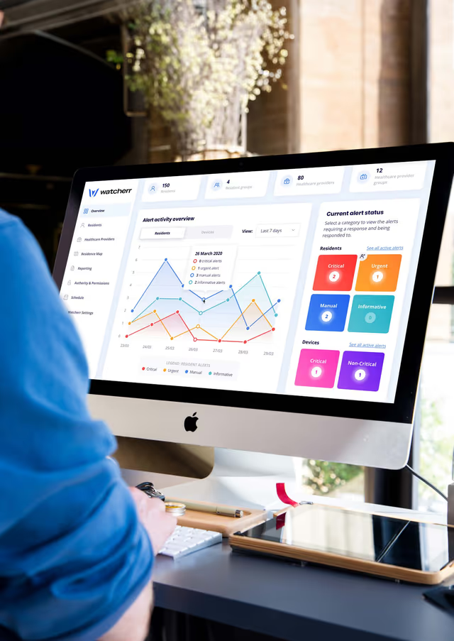
Gateway Dashboard - Monitoring Interface

Gateway Dashboard - Monitoring Interface

Control center for care home staff showing all wearable devices, connection status, and real-time alert feed.

Installation Guide

Installation Guide

Setup documentation showing how to pair devices, configure gateway, and deploy system across care facility.
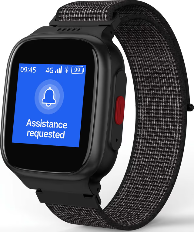
Device Alarm Activation

Device Alarm Activation

Visual demonstration of resident activating device alarm when assistance is needed.

Click any image or video to expand · ← → keys navigate

Watcherr

More from Watcherr

now ixicare

On-Device Activity Recognition - Care Wristband

End-to-end ownership

On-device caregiver activity classification for a Nordic nRF52 wristband, covering IMU data collection, Edge Impulse training, TFLite Micro firmware, and a BLE activity viewer. It runs in 64 KB of RAM without a cloud round-trip.

Edge ImpulseTensorFlow Lite MicroC

Watcherr - Connected Safety Platform

Full ownership

Full product ownership across the Watcherr V1 lifecycle: authored the PRD and Product Specification, defined the V1 and V2 risk assessment matrices, owned the Q3 2024 product roadmap, and led the Watcherr Pro validation presentation. Bridged care-home operational requirements with hardware and firmware engineering constraints for a regulated IoT safety device.

PRDProduct SpecificationRisk Assessment (ISO 14971)

BLE Wearable System Architecture & Protocol Design

Contributed to

Contributed to the system architecture and protocol design for the Watcherr IoT wearable platform: 7 custom communication protocols (BLE packet definition, OTA DFU trigger, alarm state machine, RPC, WebSocket, sticky notification, sticky message), fail-safe system design, and software state-loop architecture spanning device, gateway, and cloud.

BLEWebSocketNordic DFU

Interested in this work?

I can walk through the architecture and code during an interview.

Get in Touch All Projects